Dulux Trade has revealed its ColourFutures™ 2020 palettes including Colour of the Year for 2020 Tranquil Dawn™.
Now in its 17th year, the four Dulux ColourFutures™ 2020 palettes have been selected to support professionals when it comes to colour and design in commercial and public buildings.
The new Colour of the Year, Tranquil Dawn™ is a versatile, soft green hue with a calming, restful quality that perfectly supports our inclination to blur the boundaries between indoor and outdoor spaces.
A panel of experts selected the colour to embody the nation’s mood on the approach of a new decade. It reflects a growing desire to understand what it is to be human at a time when advances in technology are making us feel increasingly disconnected from each other.
The almost ethereal dimension of Tranquil Dawn™ creates an illusion of space and perspective, a nod to the biophilic design values that espouse the benefits of a greater connection to nature, natural materials and daylight.

The natural colour is reflective of a need to disconnect from technology and bring the outside in, with the varied supporting palettes allowing architects, specifiers and designers to select from a complementary range of subtle but contemporary colours.
An eminently usable shade of green, it will happily stand alone in a space, creating a restorative overtone or pair with other colours within each of the four supporting palettes – acting as a soothing anchor to pops of richer, more dynamic shades.
Tranquil Dawn™ is a superbly adaptable option for design professionals for a range of environments, from education and healthcare facilities to residential homes and offices.
The ColourFutures™ 2020 palettes were selected by an expert panel of colour designers, trend forecasters, design specialists, architects and editors from around the world, chaired by Heleen van Gent from the AkzoNobel Global Aesthetic Centre.
Heleen explains: “We live so chaotically that our homes, workspaces and other parts of the built environment really need to be safe spaces where we can feel both relaxed and creative.
“We want to be able to unwind and separate ourselves from the chaos that goes on around us and have time to regroup and find peace.”
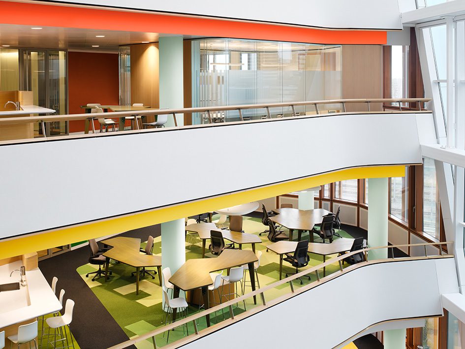
The four trend palettes capture the essence of being human and show how Tranquil Dawn™ can be used to create spaces which enhance what occupants need and want in the year ahead: to seek Meaning, to Care, to Play, and to encourage Creativity.

Heleen adds: “When you look at how our ColourFutures™ palettes have evolved over the years, you can chart the fluctuations in our consumers’ appetite for different colours and spot connections with what is going on in the wider world. For example, in 2017, when consumers felt a need for balance and calm, the palette was dominated by cooler shades of blue and grey. While in 2019, there was then a greater sense of uncertainty which was reflected in a desire for warm, comforting colours that provided solace and refuge.”
Marianne Shillingford, Creative Director, Dulux UK, continues: “We understand the importance of creating future proofed spaces that have tangible occupant outcomes and as a new decade heralds a new dawn, the hazy pale green tones of Tranquil Dawn™ are calming and comforting just when occupants need it most in their lives. When paired with neutral pastels and rich jewels it becomes incredibly powerful at creating spaces that encourage making better human connections, enhancing wellbeing and productivity as a result.”
The Global Aesthetic Centre has been responsible for the ColourFutures™ trend analysis, colour research, colour design and art direction at AkzoNobel for the past 17 years. Led by Heleen, the unit continuously monitors social, cultural and design trends as they emerge all over the globe. By connecting these unique insights to everyday life, the team provides informed trend direction.
The ColourFutures™ 2020 palettes:
- THE MEANING PALETTE
Inspired by a cold winter’s dawn, this minimalist palette features icy green, warm cream and charcoal hues, creating a feeling of calm and contemplation.
- THE CREATIVITY PALETTE
Inspired by a warm autumnal day, a sumptuous palette with maroon and tobacco hues, pale and moss greens provide a sumptuous space for self-expression and storytelling.
- THE CARE PALETTE
Inspired by a hazy spring horizon, this palette evokes a feeling of deep relaxation and peace thanks to a blend of earthy neutrals, muted greens, dusky pinks and pale blues.
- THE PLAY PALETTE
Inspired by the horizon of a hot summer morning, this palette features vivid reds, alongside baby blue, cream and pale green.
To see how ColourFutures™ 2020 can be used in client projects, click here.
ColourFutures™ is part of the ongoing commitment Dulux Trade makes to investing in colour and the future of paint and coatings. It comes as the manufacturer has launched the Dulux Trade Colour Schemer, a bespoke online tool allowing professionals to visualise Dulux Trade colour schemes in their space during the design process.
—